Create
Client
Yara Communication
Industry
Advertising
Category
Ad Campaign
Challenge
The Ideabook is a weekly journal that Yara Communications gifts to their clients and well-wishers. It is very minimally designed, representing Yara and its design principles. I was given the task of redesigning the book for a new edition to be released in 2021.


The brief given:
- Must be minimal.
- Should not change drastically from the previous edition.
- Should promote Yara and its works.
- Should maintain Yara's character and design principles.
- Should be fun and user-friendly to the max.
- Something new with engaging content.
Solution
The journal diary was redesigned to meet all the needs on the brief and more. Initially the name of the journal “ideabook” was the changed. It was changed to “Create” encouraging the user to go forward and create anything, but then down comes the motto of the agency “magic or nothing”, suggesting when one does create, be it something magical so as to fulfill the books purpose to be a tool of creative excellence.
The name was moved to the bottom left for maximum balance and aesthetics, along with functionality. Next the leather cover was removed and a paper cover was chosen, that was in-between matte finish and texture (leather) for maximum durability.

Design
The journal diary was redesigned to meet all the needs on the brief and more. Initially the name of th journal “ideabook” was the changed. It was changed to “Create” encouraging the user to go forward and create anything, but then down comes the motto of the agency “magic or nothing”, suggesting when one does create, be it something magical so as to fulfill the books purpose to be a tool of creative excellence. The name was moved to the bottom le for maximum balance and aesthetics, along with functionality.

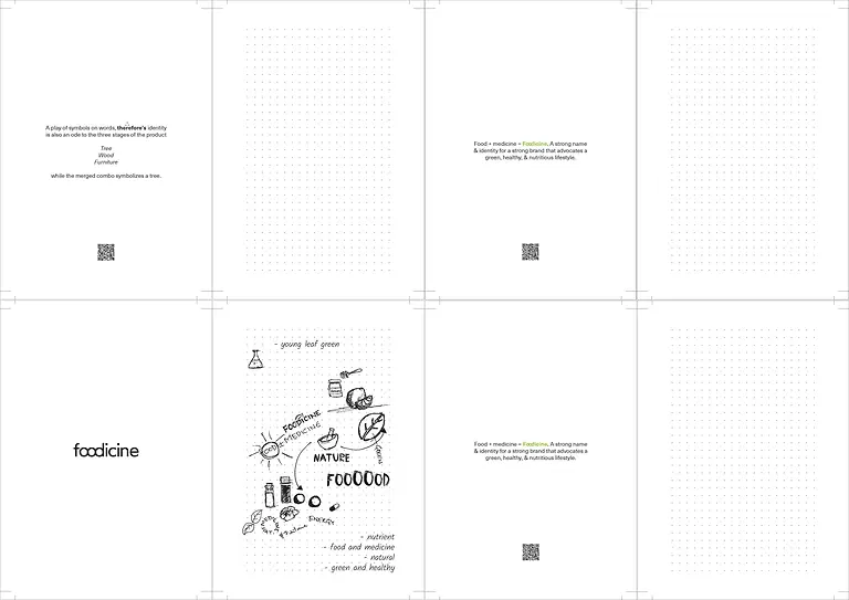
Taking in the fact that Yara wished to promote the agency and its own works through this edition of the journal. We decide to showcase the behaind the scenes of their branding process, especially through the logo designs yara has done through the years. This would go on to be, on of the main attraction and egaging factor of the journal, which in retrospect mainly focused on user experience design, being very plain and minimal. We decided to recreate the logo sketching process into a storyboard which would explain the logo itself or its characteristics.
Content
Special thanks to the content writting team for their help in making a custom copy for the journal.